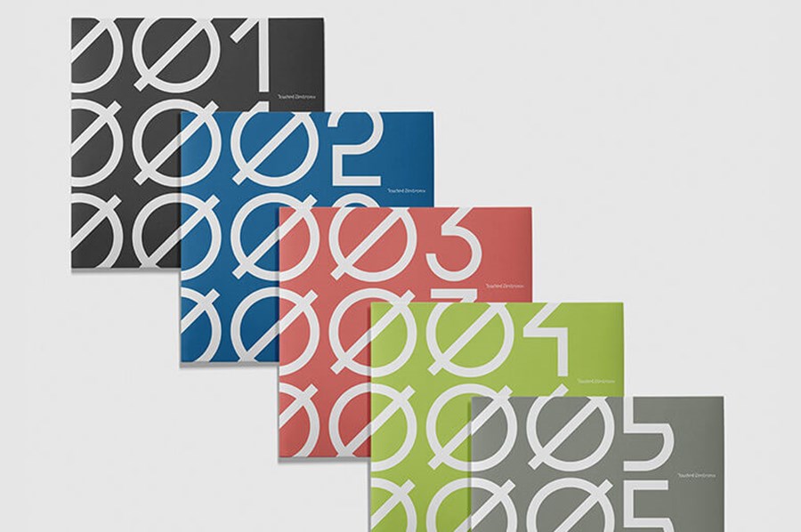
Dyadik — record label branding and artwork
Logo, branding, album artwork and packaging design for a small label I run with Martin Boulton (Touched Music).
I work with Martin a lot – designing for his various labels, we're both into the same music and decided to start a label together. Whilst brainstorming names I found dyadic (something that consists of two parts or elements) and we went on to use this concept as the starting point for the branding. The wordmark started life as an experiment to construct each letter of Dyadik with just two shapes. It's abstract but keep looking and the name reveals itself (a bit like music needing attention to fully appreciate), there's also a symmetry to the D and K at each end holding the logo together (and is why the catalogue numbers have > <).
From there I designed an icon (a stylised two in roman numerals), a custom typeface and some geometric repeat patterns, all constructed using just these two shapes. Various weights of the Archia font is used for all other text.


As the label has evolved, the packaging has become a way for me to explore bespoke ideas of how to house physical music in interesting ways within a limited budget. On the latest releases I have spent many hours hand assembling the various elements.


Murya – Northern Lights >1<
The first Dyadik release (catalogue number >1<) comes in a gloss laminated 4 panel card case with matt obi. I wanted to create a distinctive yet flexible look for the label's releases. The artist and album name typography and patterned background are all constructed from the two Dyadik shapes. Gradients inspired by the colours of the aurora borealis cover the inner and outer sleeve, the gloss laminate gives the colours depth and richness, contrasting with the uncoated plain paper obi.


HRYM – Organik >2<
Limited edition CD in a matt laminate 10 panel bespoke card sleeve. For the second release I continued with the custom type (based on the shapes of the logo) and geometric graphics established with the label's first release. The folding card sleeve was inspired by a flower image the band supplied (which ended up as the blurred background) and is like the petals opening to reveal the CD. There are multiple ways to fold the cover, creating many variations. I also explored mixing nature with the man-made: the contrast of the soft blurred flowers with the angular type and hard edges of the flaps as they overlap.


Various Artists – Adykt >3<
Limited edition 2CD compilation in a clear jewel case with transparent sticker. The name (Adykt = Addict) came from noticing it was almost part of the label name – dy-adik(t) and thought it was a perfect title for this release. I always want to try and do something a bit different with the packaging for Dyadik and it's fun to come up with solutions within a limited budget. One of the things I love to do with physical media is layer elements to create the design (which I did again on the following release). We went with a white ink transparent sticker rather than screen printing but I think the results look just as good. As with previous releases, the title text is made from the logo shapes, the circles on the CDs represent track length.


Heogen – Oxygen Fields >4<
Limited edition, glass mastered CD in clear wallet with double sided insert, printed on pearlescent paper, housed in a translucent anti-static bag with white ink transparent sticker on the front. I wanted to do something quite bright and optimistic, possibly with a holographic feel, as that is how the music feels to me – it would also be a contrast to the first Heogen album art. I spent a long time looking at things we could use for album packaging and pricing up different options within a budget that would work for a small quantity. The various elements were all ordered separately and assembled by hand. We put 100 copies on Bandcamp and they sold out in under 24 hours. I am really happy with the finished product and love how the artwork layers up through the translucent bag and sticker.


exm—comp >5<
Continuing the quest for unique packaging with Dyadik release 5… limited edition glass mastered 2CD compilation of selected works by exm, presented in a hand assembled custom A5 gatefold sleeve, printed on recycled 350gsm matt card, with removable gloss sticker holding the case shut.
Seeing as this is a compilation album, I has the idea to make the big artist and title text out of smaller type about each track – literally a design made from the tracks, I wanted to do it in a way that isn't too easily to read. This also carries over to the big track listing on the inside. I hid the credits under the sticker so they only get seen when opening the sleeve. The background is an inverted image of lava by Pawel Czerwinski, listening to the music put the idea of "cold lava" into my head.
Everything was delivered to me separately and I hand assembled 200 copies which sold out in about 24 hours.


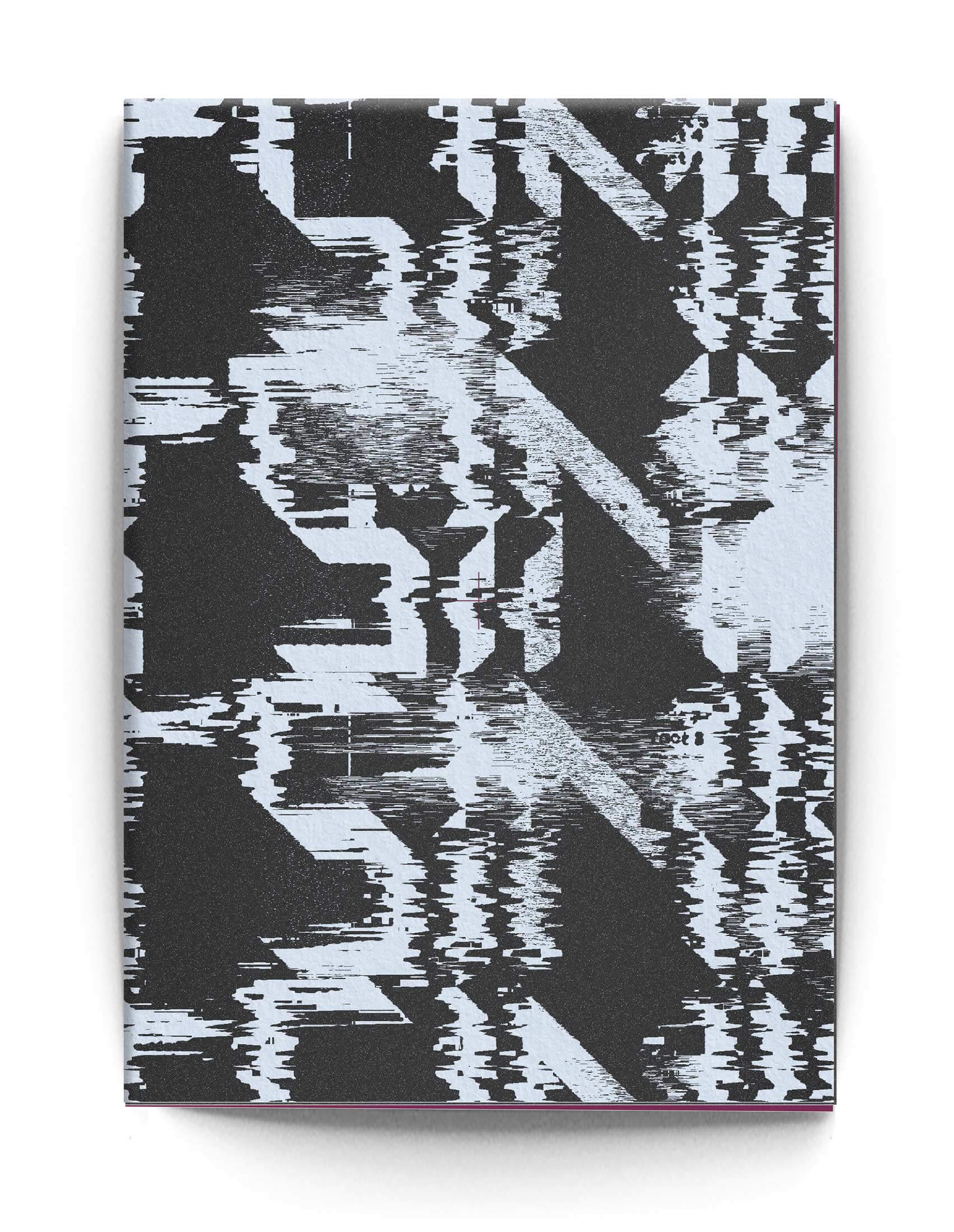
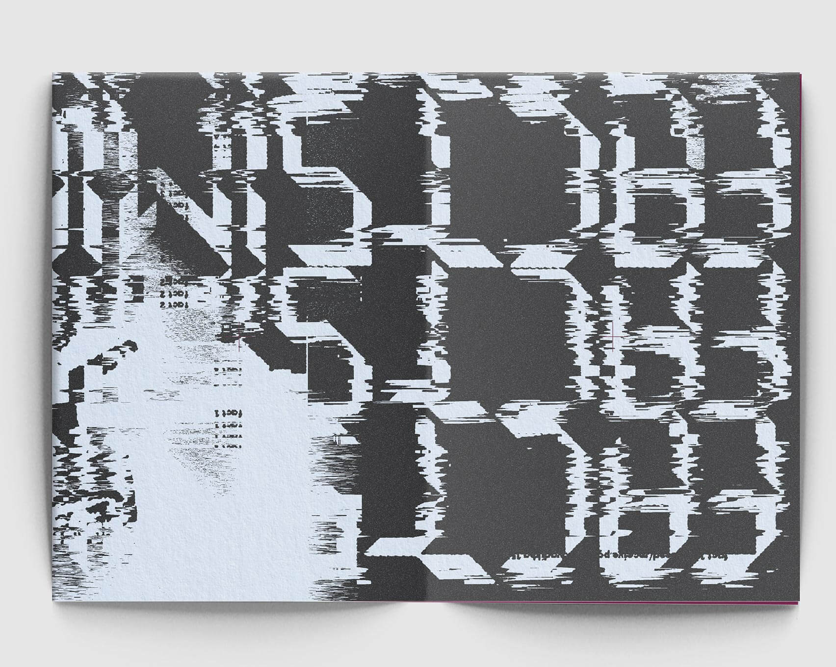
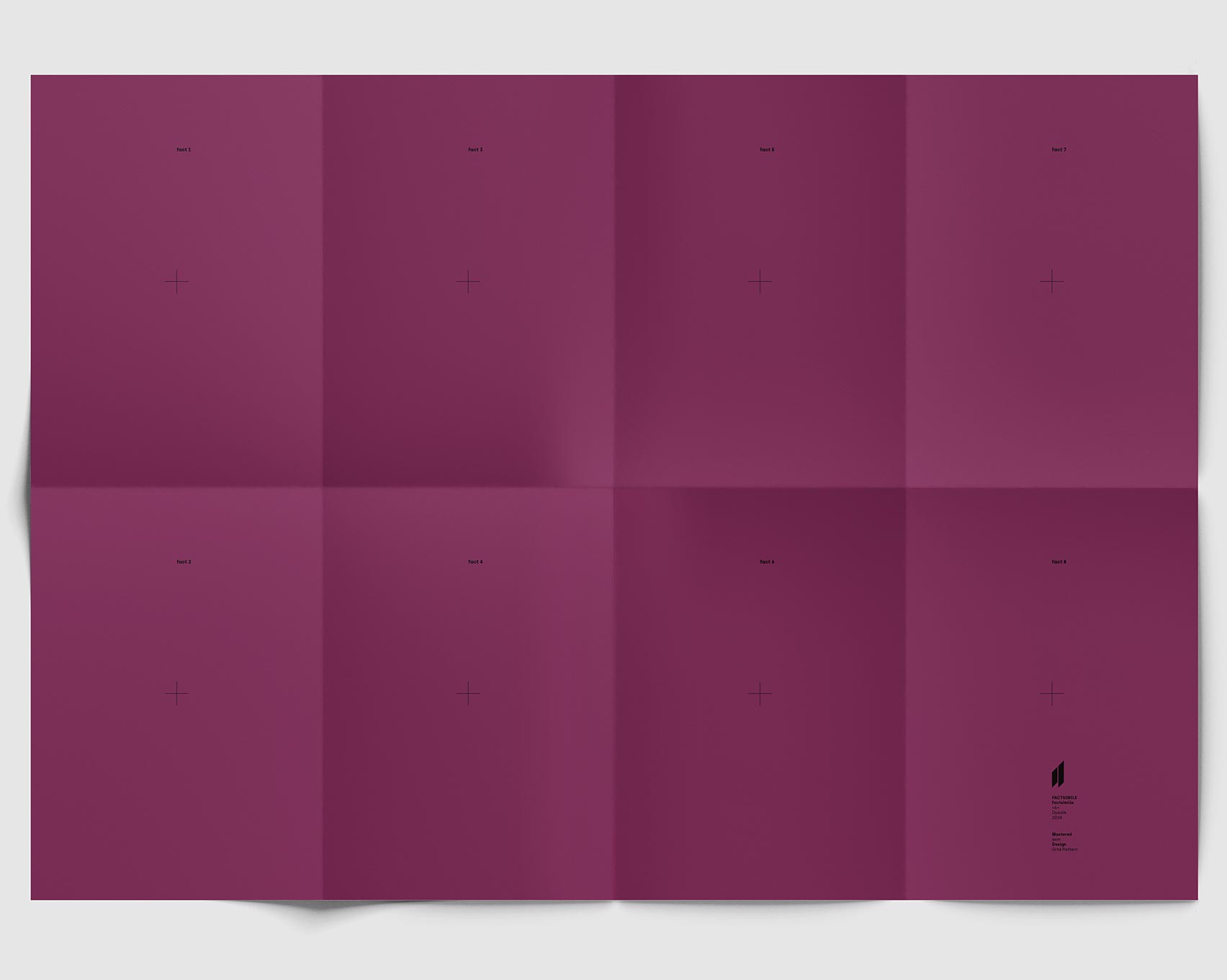
Factsimile – Factsimile >6<
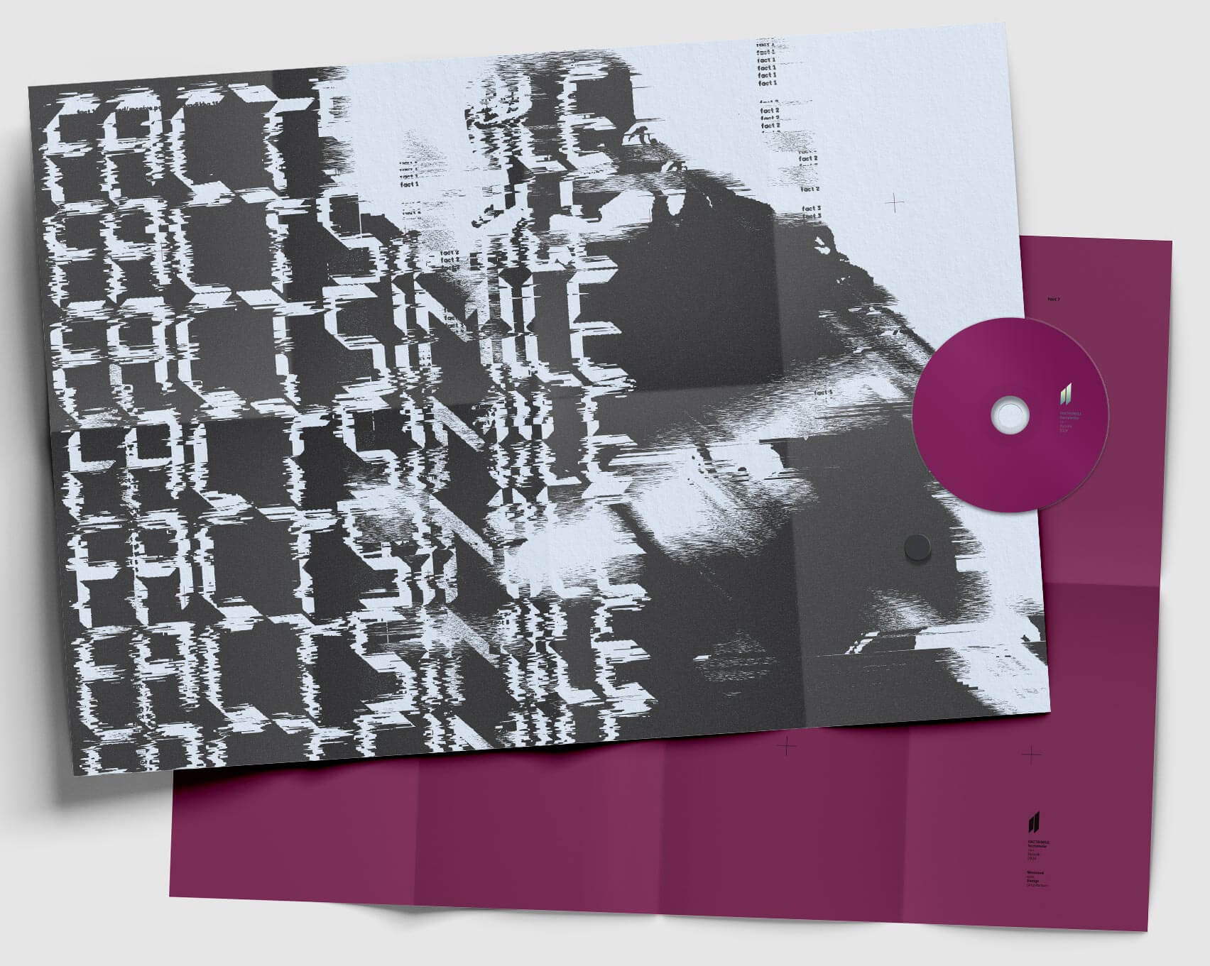
Glass mastered CD housed in triple folded double-sided A2 poster printed on 120gsm uncoated matt paper folded to A5 size. Inspired by the track titles being Fact 1-8 and the whole notion of facsimile, the design is made up of repetition. The title is repeated and distorted along with a photo of the, as then, mystery artist – in the end we revealed it is Michael Robinson. The folded poster idea for the packaging comes from the fact the album is eight tracks and there are eight panels on each side of the A2 poster. Plus folding A2 to A5 makes the artwork a similar size to the last two Dyadik releases.



Most physical formats are sold out but for anyone wanting to check out the music, please visit our Bandcamp page.

